The Official Google Website Optimizer Blog - The most up-to-date product news, industry insights, and testing strategies
Showing posts with label Guest author. Show all posts

Creating Targeted Tests using DoubleClick Ad Planner and Website Optimizer

Monday, August 02, 2010 8/02/2010 01:09:00 PM

This guest post was contributed by Daniel Waisberg, the Founder and Editor of Online Behavior, a Marketing Measurement & Optimization website. Daniel looks at how you can use DoubleClick Ad Planner to find ideas for testing.

Testing is probably the most effective way to optimize websites. Through testing we can understand what our customers like, which ultimately will help us create a better customer experience for our audience. But "our audience" is usually not a unique type of person; it is important use techniques such as Test Segmentation to understand the differences in the tastes of each cluster of customers.

However, where can you get ideas for tests? How do you choose, for example, if you should use an image of a man, a woman, a couple, a baby or a family? Most of us do not have the privilege of testing the YouTube homepage: traffic is limited for most sites, so it is important to run tests that have a high chance of making a difference. We have to focus our efforts on our best guesses. In this post, we will show a way to use DoubleClick Ad Planner to research for testing ideas that will be tailor made to the segments you are trying to target in your website.

Finding Your Audience on Ad Planner

In a recent blog post on the DoubleClick Advertiser Blog, the DoubleClick Ad Planner mission is described as:
...to provide the deepest, most accurate insight into online audiences possible. This insight helps display advertisers select the best sites for their media plans and drive results for their campaigns.
However, I believe this description is missing an important part, which is not less important to advertisers: to understand your audience tastes and which kind of websites they like. The DoubleClick Ad Planner provides important insights into how to design your campaign landing pages and your website at all.

So, let's suppose I am working to optimize the eMetrics Summit website for the San Francisco conference in 2011. The Summit targets marketing managers, web analysts and business intelligence experts that are trying to understand how to increase the return on online investments. Here is how to find the tastes and preferences of this audience:
  1. Sign in to DoubleClick Ad Planner and create a new Media plan;
  2. Go to Research tab, choose the Research by Audience secondary tab;
  3. Choose among the various segmentation options in order to narrow the audience and the websites they visit. Below are the segments chosen for eMetrics San Francisco audience:
  • Geography: chose country USA and refined it to include only West Coast states. That's the main target for this show since eMetrics also hosts a Washington DC conference
  • Demographics: included both males and females, between 25 and 44 years old, with at least a bachelor degree, with a household income above $75K. I think this segment is very close to the audience of the conference (but I have no inside information)
  • Online Activity: chose a large website that the audience is likely to visit: Google Analytics
  • Interests: chose everything under 'Business' and 'Computers & Electronics'
  • Ranking Method: chose the ranking method to be 'Best Match' since we are not doing this analysis in order to find a place to advertise (in which case we might sort the websites by reach), but to find a place that our target likes to visit
Below is a screenshot from DoubleClick Ad Planner showing all the segmenting options and the audience created above. We can call the list created below "Website Testing Inspiration"

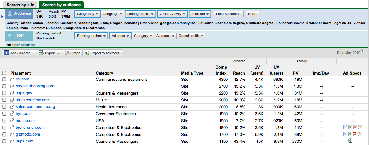
Click for full-size image

Getting Ideas for Your Test

Once we find the "Website Testing Inspiration" table, which shows the websites where our targeted audience is surfing around, we have the raw material necessary to get ideas for our testing efforts. Continuing our example above, we can visit the websites in the Top 10 websites that match our audience and start analyzing them.

So, here are a few insights from the analysis above for the eMetrics San Francisco home:
  • First of all, looks like Jim Sterne chose the right color, blue is very prominent in all the websites;
  • Idea #1: it could be worth a try to add some geeky machines to the page, such as in the Pitney Bowes, Kaiser Permanente and Frys websites;
  • Idea #2: call these companies and have someone present at eMetrics and feature it at the conference homepage;
  • Idea #3: submit a post to both TechCrunch and Gizmodo, which would certainly be happy to feature interesting content about social media metrics. The posts would be useful in order to promote the conference and, in terms of testing, the eMetrics homepage could try featuring in a prominent place that the conference is being quoted in these websites (something like "In the news");
  • Idea #4: interesting to see that Stack Overflow is number 5 on the list, a website for "professional and enthusiast programmers". It looks like many technical people are inside this audience. Maybe it could be worthwhile to try showing a classification on the site targeting different types of people: "Programmers only talks", "Business Minded talks", "Marketers, Statisticians and liars"...
These are initial ideas that should be discussed and improved based on the website and the target being studied. As the analysis gets deeper, the insights will become more valuable.

Bonus: Instead of looking for your audience and which sites they visit, you can also look into your competitors' sites and understand which segments they are attracting that you are not. Read more about it on Avinash's post: Competitive Intelligence Analysis: Google / DoubleClick Ad Planner.

​25 Google Website Optimizer Tips for Better Product Pages

Tuesday, February 23, 2010 2/23/2010 02:28:00 PM

Late last year, a fantastic post went around the Internet with 55 Google Website Optimzer Tips and Tricks. Today, we have a sequel for you. This is a guest post from Khalid Saleh, who is the president and cofounder of Invesp, an ecommerce conversion rate optimization company.

Change the way you see your site with Browser Size

Tuesday, January 19, 2010 1/19/2010 03:29:00 PM

This is a guest post from Jesse Nichols. Jesse is part of the Google Analytics team and is one of our Analytics gurus. Here, he shares a new tool in Google Labs that can help you see how visitors see your site.

​The easiest websites to optimize are the horrible ones. In fact, the hardest part about optimizing a site that has a million and one problems is deciding which ones to go after first. However, where do you begin if you have a beautiful, clean, profitable website? If there are no clear issues - if the calls to action are visible and the page uncluttered and the buttons big and shiny - then what can be done short of remaking the entire site (an idea as scary as it is unnecessary)?

Sometimes, all you need is a change in perspective. We, the web savvy, see the Internet through big, clear monitors and 11 point font. We look at our site and we can’t understand why anyone wouldn’t be able to perform whatever task the site is designed to do. Well, to that end, Google Labs has created Browser Size. This nifty little tool allows you to see how much of your webpage is immediately visible to your visitor depending on the size of their monitor and resolution settings.

The concept of “the fold” of a webpage (as in “above the fold”, i.e., what can be seen upon landing on a webpage without any scrolling) is not a solid line that snips the bottom off every page, but rather a subjective experience. The notion of having important links, buttons and messages above the fold is taken for granted as a good policy, so what if you found out that 20% of your visitors couldn’t immediately see what you thought they could?

Plug your site into Browser Size and you’ll get that perspective. Each band of color represents approximately how many visitors will see that section immediately upon landing (the seemingly shaky lines are actually a true representation of the visible area excluding the title bar, toolbars, etc). If you have important information or buttons in the 70% range, that means 30% of your visitors are forced to scroll to see that information and convert.

Take a look at this example from the Website Optimizer homepage:


Click to see full-size

As you can see, most people can see our primary call to action, the “Start testing now” button. However, some of our educational content like Benefits and Testing 101 sections is below the fold for 50% of viewers.

Think the numbers are different for your site? Browser Size bases its data on a sample of visitors to Google.com, but you can check out your screen resolutions report in your web analytics tool to see the most common visitor screen resolutions for your own site. For most sites the list of dimensions is quite long, and the ones we in the industry tend to use – 1024x768, 1280x800, 1280x1024 - typically only represent about 50% of the visitors at best.

So get back to the optimization grindstone, squeeze another percentage point or two into your conversion rate, and give all of your visitors the experience they deserve. You can start using Browser Size at http://browsersize.googlelabs.com

Thanks again to Jesse for sharing this post with us.

Using Website Optimizer with Google Analytics - Case Study with Catalogs.com

Tuesday, October 27, 2009 10/27/2009 09:54:00 AM

The following is a guest post from Julie Ferrara-Brown, Director of Quantitative Analysis for WebShare. WebShare is one of our Website Optimizer Authorized Consultants. The case focuses on exploring more than just a single conversion.

Often, optimizing a site means more than optimizing for a single conversion. Understanding how your test pages and sections affect bounce rate, ecommerce revenue, time on site, and all the other metrics provided by Google Analytics can be even more useful than a single conversion rate in painting a picture of how your site is used.

Good news! You can use Google Website Optimizer and Google Analytics together to open up a whole new world of optimization and testing for your site.

A Single Conversion is Not Enough
Catalogs.com worked with WebShare, a Google Analytics & Website Optimizer Authorized Consultancy, to plan and run a test that integrated both tools to collect and analyze a wealth of data. With a number of different monetization paths, the Catalogs.com website wanted to know not only whether alternative versions increase overall conversions, but also what impact would these versions have on specific types of conversions and the revenue associated with them.

During this test, while Website Optimizer as a standalone tool was able to show that overall conversions had increased by 6.8%, the integration with Google Analytics showed much more granular and relevant improvements:
  • Specifically, catalog orders rose by almost 11%
  • Total revenue from all conversion types was up 7.4%
“It’s great to know that the changes we tested gave us an increase in our overall conversions, but all of our different conversion actions are not equal in terms of the revenue they bring in,” explains Matt Craine of Catalogs.com. “It’s possible that the increase in overall conversion rate could actually lose us money because it was due to a design enticing visitors toward a low value conversion at the expense of our higher value actions.”

Setting up the Test
The aim of this experiment was to test different layouts across all of the sites’ merchant pages. The experiment was set up as a single variable, four-state MVT, encompassing every one of these merchant pages.

Three variations were created, and each merchant page was available in one of its three formats by using different file extensions (.alpha, .beta, and .gamma). The test variable was actually just a piece of script that controlled which version of merchant pages a visitor would see.

Running the Analysis – Website Optimizer
Over the course of a few weeks, almost 70,000 unique visitors participated in the experiment and performed almost 30,000 overall conversion actions. We could see in the Website Optimizer experiment reports that we had found a winner in the Beta version:

This, however, simply told us that Beta was more likely to result in a conversion, regardless of type or associated revenue. Enter Google Analytics.

Getting Additional Data From Google Analytics
In this case, the easiest way to see the Google Analytics data for each variation is by using Advanced Segments. Since each template had its own extension, we can create an advanced segment that matches the “Page” dimension with a specific extension. The result is that the segment will only include data for sessions that included a pageview on one or more pages that matched that condition. Below is an example for the Alpha variation:

After creating a segment for each of the variations, it’s simply a matter of applying those segments to any report in Google Analytics and setting the appropriate date range. Now we can see, side-by-side, data for all the variations in any of Google Analytics’ reports.

Running the Numbers
As an analytics platform (and not a testing platform), Google Analytics was not designed to perform the necessary statistical analysis to evaluate this data, but with the numbers it provides, you can perform an enormous amount of offline analysis. Let’s take the case of the bottom line, be-all, end-all metric: Total Revenue.

For all the statisticians out there, in this particular case an F test blocked by day was performed to compare means. The results can be seen in the following analysis.


What this boils down to is that circles that do not overlap or barely overlap represent a significant difference, and in this case the Beta variation is statistically our best variation in terms of generating revenue.

Why Look at Lots of Metrics?
Although we’ve only shown revenue analysis here, it’s important to note that performing this kind of analysis on a number of different metrics can really help you understand your visitors and their experience.

For example, during this test we also found that the Beta version (the version that provided more conversions, more high value conversions, and more revenue) also had the worst bounce rate!

Just because a visitor doesn't leave a site from the first page they land on does not mean they are going to convert.

Get Integrated!
Depending upon your test type and implementation, there are a number of different ways to integrate Website Optimizer experiments with Google Analytics, and hopefully this post has helped to demonstrate the power of having all that wonderful data available in your testing.

“Looking at a puzzle piece by itself is a good way to start toward a solution, but it doesn’t tell you the full story,” says Catalogs.com owner Leslie Linevsky. “Putting all those pieces together shows me how small changes are impacting my business as a whole.”

Thanks to WebShare and Catalogs.com for sharing this case study.

Landing Page Testing with Offline Conversions using Website Optimizer

Wednesday, April 29, 2009 4/29/2009 10:21:00 AM

This is a guest post from David Booth at WebShare, a Website Optimizer Authorized Consultant. In addition, David is one of our Google Website Optimizer Seminar Leaders.

Can you use Website Optimizer to test your landing pages if your conversion occurs offline?

We know Website Optimizer is great when the conversion happens online, but what if your goal is an offline conversion, such as getting the phone to ring? Conversions are defined with JavaScript that has to be executed by a browser, so testing with a tool like GWO may sound like an impossible task – but it’s not.

Pacific Hills Treatment Centers was able to achieve a 40% lift in phone leads via their top landing page by using Website Optimizer, and this post will show you how they did it.

The Offline Lead Generation Dilemma

Tod Cunningham, VP of Business Development of PacHills found himself in a familiar position. “I was discussing how to get a better conversion rate out of my landing pages with my AdWords rep, and when she mentioned conversion testing my first response was, ‘That’s not going to work for me, my conversion doesn't happen on my site.’”

As is the case with many lead-gen sites like PacHills, a conversation with a real, live, human being is much more likely to turn a visitor into a customer, and is often necessary during the sales cycle.

With our help, an A/B test was created and run to test three alternate variations of a top paid search landing page. The goal of this page was not to get an online form submission or get a visitor through a shopping cart, but to get visitors to pick up the phone and call.

How to Test Offline Conversions

So how do you run a test with a phone call as your conversion? This can be done by using Website Optimizer alongside just about any of the widely available phone tracking solutions out there.

1. The first step is like any other test – after consulting your web analytics to determine the best candidate for the test page and experiment type, it’s time to create the variations. Ask yourself what changes you’d like to make and why you believe those changes will have a positive impact on conversions, and let that guide your variation design. In this experiment, WebShare’s design team helped facilitate this process and created three different alternatives to the original landing page. The original and winning pages are pictured below:

Click to see a larger image

2. Now it’s time to set up the phone tracking. All we really need to do is place a special phone number on each of our test pages that will tell us which of our different pages originated the call. In this case, ClickPath was used to automate this by assigning and tracking calls from phone numbers (or banks of numbers) dedicated to each specific landing page.

3. Next, set up the test in Google Website Optimizer. This example is of the A/B variety, where the original was defined along with three variations. You could do this as a Multivariate test as well.

4. After validating the alternate pages and previewing the variations in the preview tool, launch the experiment.

5. Patiently let the experiment run and collect your data.

Running the Analysis

At this point you’ll have Google Website Optimizer splitting traffic, recording unique visitors, and handling all your cookies to ensure that repeat visitors continue to see the same variation. Your phone tracking application will be recording the phone calls (conversions) that result from each of your variations, and you now have all the data necessary for your analysis.

Because Website Optimizer displays the data it’s recording, you can run the statistics yourself at any time using any tool you’re comfortable with. A simplified set of free conversion marketing tools is available on WebShare’s site to help you get the results you need. Here’s how:

1. From Website Optimizer, you’ll get the visitors data in your experiment report:

2. Your phone tracking software will provide your conversion data:

3. Next, plug these values into a tool (like this one) that will do the number crunching for you:

4. The last step is to run the numbers to get a report:

Start Answering Those Phones!

This particular experiment found a clear winner – a winner that boosted the likelihood of a visitor calling PacHills by over 40%.

According to Tod at PacHills, “This has opened up doors that we had thought were closed to us. You can bet next time you’re on our site, we’ll be testing on you!”

If you’re in a situation where a call is your conversion, then we hope this post will give you the tools to start testing and getting your phones ringing off the hook!

Writing for Conversions, Part 3 of 3 - Format

Wednesday, October 29, 2008 10/29/2008 04:48:00 PM

This is the final post in a three-part series on writing for conversions by Tim Ash, author of Landing Page Optimization. Tim is an industry expert in website optimization and his company, SiteTuners, is one of our Authorized Consultants.

In two previous posts, I examined the structure and tone of your writing as a way to increase conversions. In this blog post I will cover the remaining key element - format.

Format
Since people don’t read on the Internet the same way they read offline, the format of your writing should support their scanning behavior. Use the following guidelines to help you write scannable text:
  • Write in fragments or short sentences. Don’t worry about grammatical correctness if you have made yourself clear.

  • Use digits instead of words to write out numbers (e.g. “47” instead of “forty seven”)

  • Highlight important information-carrying words. Don't highlight entire sentences, stick to 2- or 3-word phrases.

  • Use clear, emphasized titles for page headings and important subheads.

  • Use ordinary language (avoid industry jargon and acronyms that are not widely understood).

  • Use active voice and action verbs.

  • Use bullet lists instead of paragraphs.

  • Do not use more than 2 levels for lists or headings.

  • Use descriptive link text that describes the information on the linked page.

  • Use supporting links to present supplemental information and use “see also” for cross-referenced information.
If you review your website and landing pages with a critical eye and faithfully implement the recommendations above, I can guarantee that you will make a better and more persuasive connection with your visitors. This, in turn, should make your cash register ring more often.

We'd like to thank Tim for putting together this series. If there's a topic you'd like to see us cover, please shoot us an email.

Writing for Conversions, Part 2 of 3 - Tone

Thursday, October 16, 2008 10/16/2008 04:18:00 PM


This is the second post in a three-part series on writing for conversions by Tim Ash, author of Landing Page Optimization. Tim is an industry expert in website optimization and his company, SiteTuners, is one of our Authorized Consultants.
 
The reality for most Internet surfers is that they're subjected to a barrage of promotional messages and advertising. As a basic defense mechanism, they've learned to tune out most hype.

Perhaps you do have to be somewhat crass to get them to your landing page. For whatever reason, they have ended up there. But you should now stop screaming at your visitors. You're no longer (for the moment) competing for their attention with other websites. So you need to change the focus to the task they're trying to accomplish.
 
Your visitors detest marketese. Unfortunately, your landing page was probably written in this kind of over-the-top promotional style. It usually involves a lot of boasting and unsubstantiated claims. If your company is the “world’s leading provider” of something, you're in good company. A recent search on Google turned up 8.58 million matching results for this phrase. Your claims are probably not true anyway, but even if they are you can use different language to make your point.
 
Marketese may be (barely) acceptable in your press releases when you're trying to puff up your company and accomplishments. But on your landing page it spells disaster. Marketese requires work on the part of your visitor. It saps their energy and attention, and forces them to spend time separating the content from the fluff. It also results in much longer word counts. You're missing an enormous opportunity by not creating a hype-free zone on your landing page. 

How to Avoid Writing in “Marketese” 
  • Don't use adjectives. 
  • Provide only objective information.
  • Focus on the needs of your audience. 
Save your visitors the aggravation and tell them only what they want to hear. Your editorial tone should have the following attributes:
 
Factual
Writing factually will take a little work. It's difficult to stop making subjective statements. You may catch yourself lapsing into marketese at unexpected moments. But stick with it. You'll be amazed at how much more effective your writing is. Remember, your visitor is not looking to be entertained, and certainly not to be marketed to. They're there to deal with a specific need or problem. The best kind of information you can give them is objective.
 
Task-oriented
Task-oriented writing is focused on the roles, tasks, and AIDA steps that are required to move your visitors through the conversion action. You should organize your text in the order that the visitor is likely to need it. For example, a big-ticket consumer product site might lay out the following high-level steps for the buying process: research, compare, customize, purchase. When you've thought about how to guide the right people (roles) through the right activities (tasks) in the correct order (AIDA) with your landing page, it should be clear where the gaps are.
 
Precise
Be clear in web writing. The audience can be very diverse and bring a variety of cultural backgrounds to their interpretation of your language. Be careful about your exact choice of words. Never try to be funny or clever. Avoid puns, metaphors, and colloquial expressions.
 
This is doubly true for link text or button text. Your visitors need to have a clear understanding of exactly what will happen when they click on something. Text links should describe the content on the target page. Unhelpful link labels such as “Click Here!” are a wasted opportunity to focus the visitor’s awareness on an important available option. Also, link text is used by search engines to help people find information.

If you use good link text, you'll be helping your own cause. Buttons should accurately describe the intended action. For example, many e-commerce sites mistakenly put “Buy It Now!” buttons next to products when the actual action is “Add to Cart.” Another common mistake is the “Order Now” label when you really mean “Proceed to Checkout.” This vagueness causes unnecessary stress and anxiety for visitors as they try to figure out the threat or opportunity your button presents. It's always best to remove the hesitation and assure them that taking the next step is a small and safe action.
 
Concise
Become a word miser. Ask yourself, “How can I make this even shorter? Do I really need to communicate this at all?” Brevity has several advantages. It increases absorption and recall of information. It shortens the time that visitors spend reading it—minimizing the likelihood of increased frustration and impatience. It supports the goals of inverted pyramid writing, and the scannable text requirements, which I'll describe next week.

We'll conclude this series next week with Part 3 - Format. See last week's post for ways to improve your writing structure.

Giving Your Competitors the Advantage? Website Optimization in Tough Times

Wednesday, October 15, 2008 10/15/2008 03:40:00 PM


This is a guest post from Bryan Eisenberg of FutureNow, which has helped businesses with conversion rate optimization since 1998. Bryan is also the author of Always Be Testing and a Website Optimizer Authorized Consultant.

Having weathered and learned from the dot-com bust, Bryan shares his insights on how your company should approach conversion rate optimization in these economic times.


This economic mess will touch your company. The "how much" and the "when" are yet to be determined. But they're things you can actually do something about. I doubt that you want to throw up your hands and blame everything on the economy.

If your company puts conversion optimization based testing on a budget hold, or calls testing a "luxury," you may be handing a huge advantage to your competitors.

I hope your company doesn’t think that way. Unfortunately, if your company does you wouldn’t be alone; in fact, you’d be in good company. I recently spoke with leaders at two multi-billion dollar online retailers who have told me that they are cutting their optimization budgets. Ironically, one of their competitors recently contacted us to work with them on a very aggressive optimization program.

What are these two very capable leaders thinking? They didn’t offer a lot of insight but I have three guesses as to the reasons:
  1. They tried but the vendor they used couldn’t make optimization work for them.
  2. They have been ordered to cut their budgets and something else was a priority.
  3. They don’t see themselves in control of conversion rates and think that the economy will affect all their competitors equally
Passivity! That’s the only thing these “reasons” have in common.

I’ve always seen conversion rates as something the company controls.

I’d like to share two encouraging stories with you.

In the late 90’s, we started FutureNow against the popular marketing grain. Back then, everyone was talking about eyeballs while I was screaming two words that were virtually unheard of: ”conversion rate.” My brother and I were saying “the emperor has no close!”, yet companies were focused on traffic, eyeballs, and sock puppets and not on closing the sale. Still many smart folks saw the logic and signed on.

In late 1999, we started working with an struggling online retailer of magazine subscriptions, Magmall.com. Nine years ago there was no off-the-shelf, easy to use, split testing software but we found a way to test and optimize anyway. In a short time, MagMall’s conversion rate improved from 1.21% to 4.93%. This was a game changer for them since they could afford to buy ads their competitors could not afford. Not only did they weather the dot com crash; they flourished and the owner we worked with recently sold the company.

More recently, Jigsaw Health combined our Persuasion Architecture methodology with intelligent testing using Website Optimizer, and the company’s CPA dropped from a volatile $150-$300 to a consistent CPA of way under $50. What CPA would you rather have heading into this economic storm? Highly efficient sales conversion is a competitive advantage.

The lesson is this: now is the worst time to stop optimizing. The buying and selling game has just moved to another, much tougher, playing field where the customer’s are asking more and spending less. The more you focus on them, and optimizing for their needs the easier you will find it to weather the economic storm.

I hope that I’ve inspired you to rethink optimization. Let me leave you with a few testing ideas you might want to consider. Even if you haven’t had success testing these things in the past, right now environment is ripe for the following types of tests:
  • Different price points. Price is becoming more relevant.
  • Different product copy. The product with the better perceived value wins.
  • New offers that highlight value of your service/products.
  • "Free shipping" or low-cost shipping promos or offers.
Continue to optimize your sales conversions, and you'll not only please more of your visitors but also be more efficient in your marketing spend.

Don’t give your competitors the advantage.

Thanks to Bryan for his insights. If you want additional ideas for testing, you can watch the Always Be Testing webinar series Bryan has done with our own Tom Leung. You can also read more from Bryan on his blog.

Posted by Trevor Claiborne, Website Optimizer Team.

Writing for Conversions - Part 1 of 3: Structure

Tuesday, October 07, 2008 10/07/2008 04:04:00 PM

This is the first post in a three-part series by Tim Ash, author of Landing Page Optimization. Tim is a thought leader in website optimization and his company, SiteTuners, is one of our Website Optimizer Authorized Consultants.

Our company routinely runs large scale landing page optimization tests to improve conversion rates. One of the most common components that we test is the sales copy on the page. We have found that changing your approach to writing can often lead to a double-digit increase in conversion rates.

Most of the adaptations that you need to make to your writing have a single purpose: to reduce the visitor’s cognitive load. Instead of being forced to pay attention to how the information is presented, they can devote more focus to getting their intended task accomplished. By getting out of their way, you empower them to be faster, more efficient, and effective. This will lead to higher conversion rates for you, and higher satisfaction for them.

To increase the odds of a favorable outcome you need to consider the following areas of your writing:
  • Structure
  • Tone
  • Format
In this blog post I will examine the first. The other two will be covered in subsequent posts.

Structure
The preferred structure for most Web writing is the inverted pyramid. It uses the principle of primacy (ordering) to control saliency (importance). In this style of writing, you put your conclusions and key points first. Less important and supporting information should be placed last. This is critical since most readers will choose not to read very far.

Most of this is probably not earth-shaking insight in the world of newspaper writing. Newspaper editors have a similar audience makeup: casual visitors who scan for information that competes for their attention, and consider the source as a transient and disposable resource. Because of this they have developed a very similar model. Headline size and prominent positioning indicate the importance of articles. The lead paragraph summarizes the whole story, and supporting detail is buried further down (or by following links to other pages).

Get to the point and let them decide if your content is relevant enough for them to stick around. By writing in this way you maximize the chances that they will come away with the information that you consider most valuable. The same structure should be used for creating online audio or video clips for your site.

Remember that the visitor may have arrived from any number of different inbound links and may not have a lot of context about your page. Use clear and prominent page titles to tell them why each page is important.

Make sure that you only have one main idea per paragraph. If you bury a second idea lower in a block of text, it will probably be missed as the reader jumps down to scan the lead-in text of the subsequent paragraph.

The inverted pyramid approach should be used when creating bullet lists or lists of navigational links—put the important ones on top.

Keep your pages short. This will allow them to be digested in small, bite-sized chunks that correspond to a Web user’s attention span. There is evidence to show that significantly shorter text results in higher retention and recall of information, and is more likely to lead to conversion actions. Your page should only contain important information for its topic and level of detail. You can move longer supporting text to other pages, and create links for the dedicated reader.

However, we have run across an occasional exception to the shorter-is-better guideline. Some single-product consumer websites have very long direct response pitch letters that outperform significantly shorter alternatives. They draw the reader in and encourage them to spend a lot of time on the page. After a certain point the visitor’s attention investment gets high enough to build momentum toward the conversion action. This is not to say that long sales letter pages cannot be made better. There is definitely a lot of bloat and deadwood on the ones that we routinely test and improve.

Look out for parts 2 and 3 of Tim's series over the next two weeks.